Logo Design / Brand Identity / Restaurant Industry
The Brief
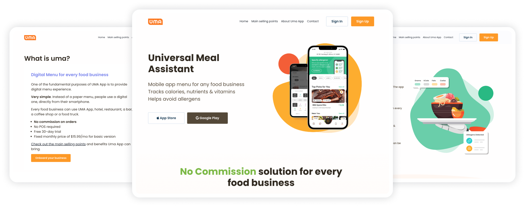
A mobile application logo is the face of the app that users recognize and remember. For UMA, an app dedicated to managing food allergies and intolerances worldwide, the logo is also a visual narrative of safety and well-being.
UMA, as a newcomer in the market, aimed to create a visual identity that resonates with users globally. The focus is about fostering a connection between users and an app that safeguards their dining experiences, making UMA a trusted mobile app in navigating food allergies and intolerances.
In this case study, we'll show you how we created the UMA visual identity step by step: from picking colors that fit our purpose to choosing a hero element that represents managing food allergies.
. Problem
01
UMA, as a newcomer, faced the challenge of establishing a brand identity that stands out in the mobile app market. Catching the eye and being memorable among the hundreds of apps required a unique and compelling visual identity. This process encompassed everything from choosing the color space to crafting an iconic logo and finding the perfect hero character.
. Solution
02
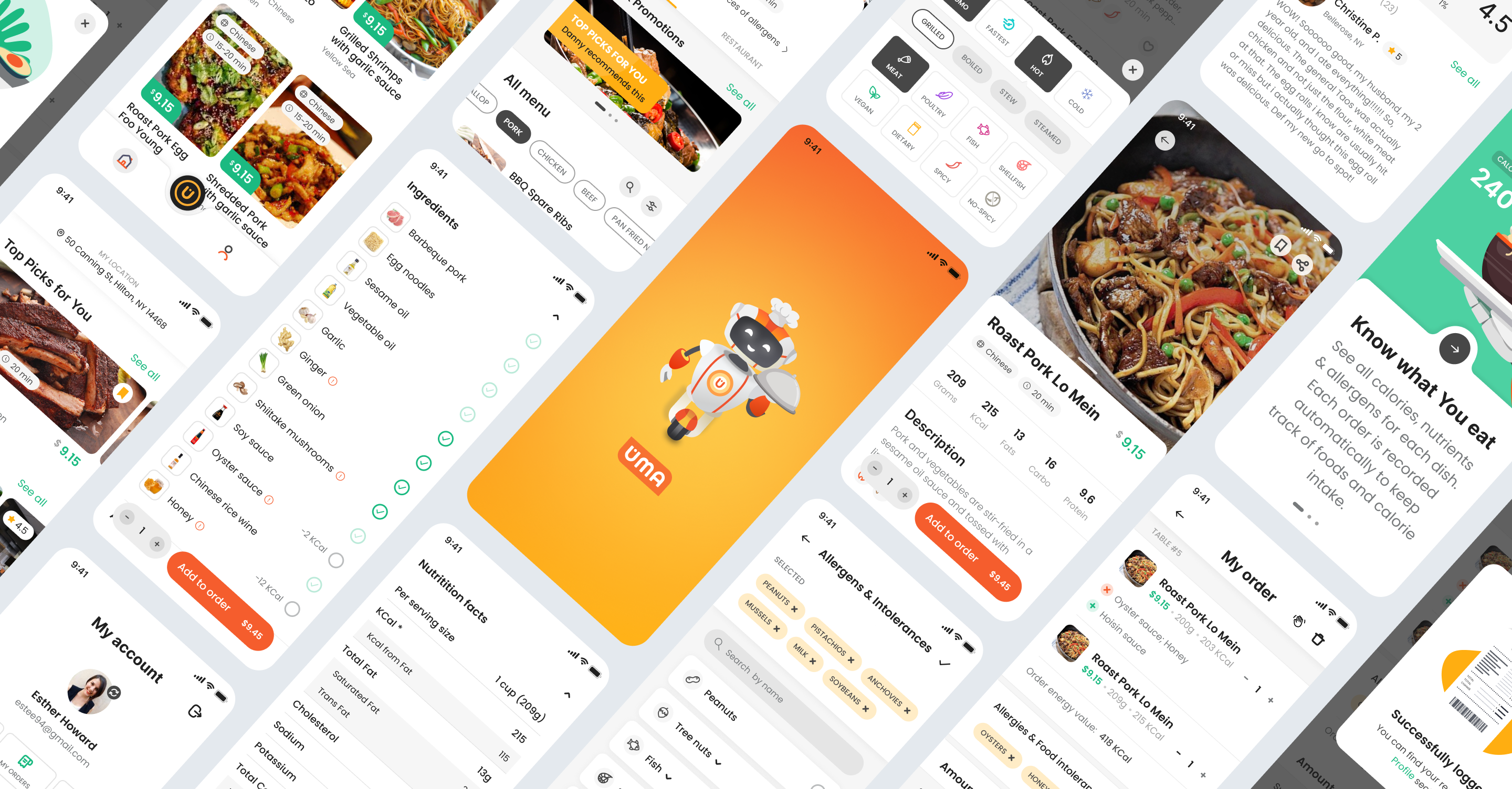
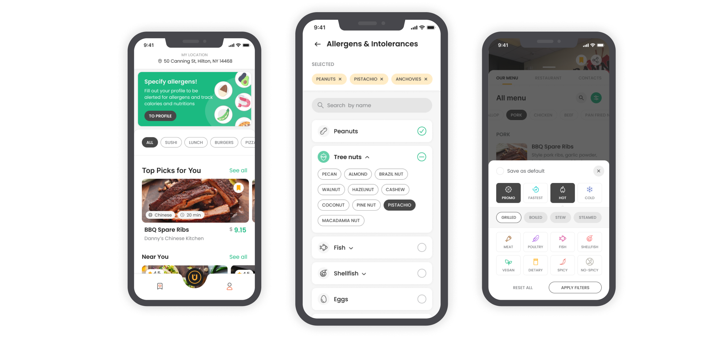
Logo
UMA's logo needed to be a visual ambassador that communicated its essence at a glance. We aimed for a logo that sticks in users' minds and associates with the app.
On different digital platforms, UMA's logo had to gracefully adapt to various sizes without losing its identity. From app icons to business cards, the logo needed to look good in every dimension.
As a distinctive touch, the logo had to incorporate the letter 'U', signifying UMA's identity in a subtle yet impactful manner.
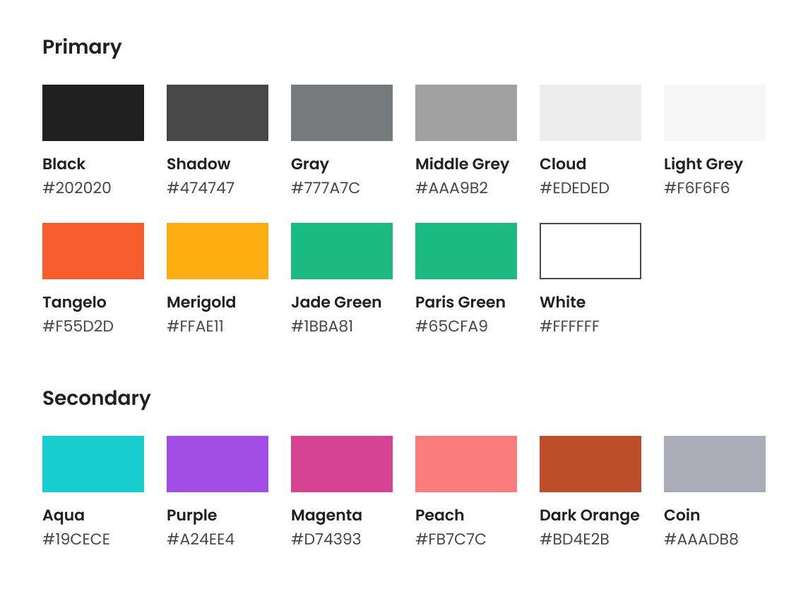
Colors Palette
UMA sought colors that would leave a lasting impression. The challenge was to find a balance — vivid enough to be memorable but not overpowering.
We aimed for colors that also work well on various devices and objects (mobile screen, business cards, accessories, website). Versatility was not just a preference but a necessity.
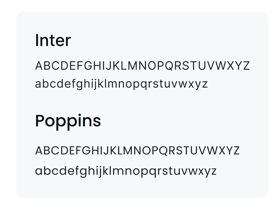
Typography
Crafting the perfect visual identity for UMA meant finding fonts that resonated with the app's mission of promoting food safety. We needed a balance between readability, modernity, and a touch of friendliness.
UMA's identity had to be professional yet approachable, making users feel secure about their food choices.
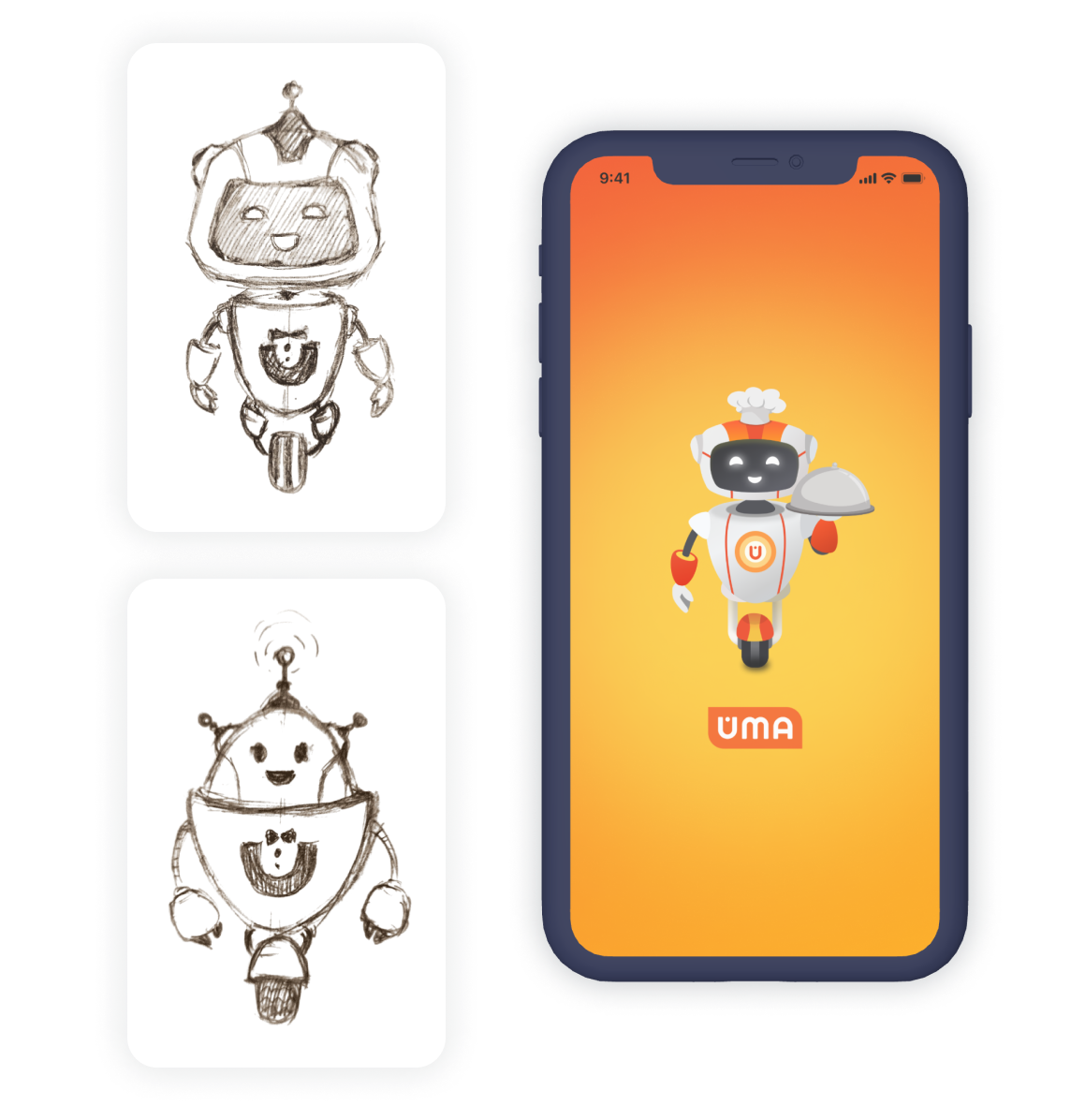
The App Hero
Searching for that one standout element representing UMA's essence - food safety and allergy management. It needed to be simple yet powerful, a symbol users instantly associate with our app.
UMA needed a hero that echoed its purpose - managing food allergies globally. The challenge was to strike a chord between relevance and memorability.
. Tech Stack
03
Figma
Adobe Illustrator
Design Craftsmanship
. Results
04
Colors: After several discussions with the designer and deep research, the primary color palette was identified into coral red and yellow orange. Coral red symbolized energy, enthusiasm, and warmth, while yellow orange added a touch of zest and vibrancy. Secondary colors include dark and green colors, black and gray hues, especially for the UMA website elements like icons, images, buttons and so on.
Fonts: We prioritized readability, opting for clear fonts. In a world where users swiftly navigate through interfaces, clarity was key to ensure users effortlessly absorbed the information presented in the UMA app. As UMA represents the future of food safety, the final set of fonts are modern and versatile.
Logo: The letter “U” took center stage for UMA's logo - it’s both simple and held significant meaning. Choosing orange and red hues speaking the language of food, health, and vibrancy, and maintaining a sense of simplicity and a delicate balance.
A simple, rounded “U” was designed to convey a friendly and approachable vibe, making it instantly recognizable among competitors on the app market. Coral red and yellow-orange were selected to evoke warmth, excitement, and a connection to the world of food. The hues tell a story of health, passion, and adventure.
Hero: Through a creative process that explored various concepts, UMA's hero emerged — a friendly robot holding a food tray, with the unmistakable letter U proudly displayed on its chest.